
As mobile eCommerce popularity skyrockets, mobile-friendly sites are more important than ever. Experts say that the pandemic sped up eCommerce growth by five years! With over half of all online shopping done via smartphones, eCommerce sites can't afford to lose mobile users. According to Shopify, within a few years, mobile will constitute 44% of all eCommerce sales. So, it's crucial for everything about your site to be mobile-friendly, including your product customizer.
Why Product Customization Must Be Mobile-Friendly
Mobile is a completely different experience with its own unique challenges. It looks and feels different and has different demographics. Also, mobile users have different preferences and intent.
A mobile-friendly product customizer is important for many reasons. They're well-researched and touted by industry experts from eCommerce to marketing and beyond. Let’s look at some reasons why mobile-friendliness should be your top priority:
Images Are Vital to Mobile Users
Good eCommerce product images boost sales. Why? They make customers more confident in their purchases. In fact, according to advertising and marketing experts at MDG:
"It's no secret that high-quality images help to sell products online, but sometimes brands overlook exactly how important they are."
Consumers describe quality images as "essential to an e-commerce experience." More consumers describe image quality as "very important" to their purchase decision than any other product page element, making them the most important thing on your product page!
Percentage of Customers Who Feel Each Element Is a Very Important Purchasing Factor:
- High-Quality Product Images: 67%
- Product Specifications: 63%
- Detailed/Lengthy Product Description: 54%
- Social Proof (Like Start Ratings & Customer Reviews): 53%
- Video: 36%
What about mobile users specifically? There's tons of overlap between mobile and local searches. Google favors both mobile-first design and local results. Customers do, too. Around 60% of people are more likely to connect with businesses that have images in local search results.
Note: Local SEO isn't just for brick-and-mortar businesses. eCommerce sites can—and should—use local SEO.
Google's mobile snippets feature is the most prominent and popular result. Google features pages with mobile-first designs and an average of 12 images. Having a mobile-friendly product customizer that generates endless high-quality images could help you get that spot.

Speed Is Especially Important for Mobile Browsing
High-quality product images are incredibly important. However, the higher the quality of the images, the slower the page can load.
Mobile users are on the go, easily distracted, and have higher bounce rates and more abandoned carts than anyone else. They're particularly impatient, and they'll leave your online store in a heartbeat if your page load speeds aren't up to snuff.
Here are the facts:
- Site visitors have a shorter attention span than a goldfish.
- Retailers' mobile sites take 6.9 seconds to load on average.
- More than half (53%) of all mobile users leave after waiting only 3 seconds for a page to load.
- Almost half (44%) of customers will leave if your Shopify product images won't load.
Mobile Screens Have Less Space
Element-rich desktop layouts may work on laptops. But smartphones often just configure shrunken elements closer together. This can easily become so claustrophobic that functionality suffers and customizing becomes impossible.
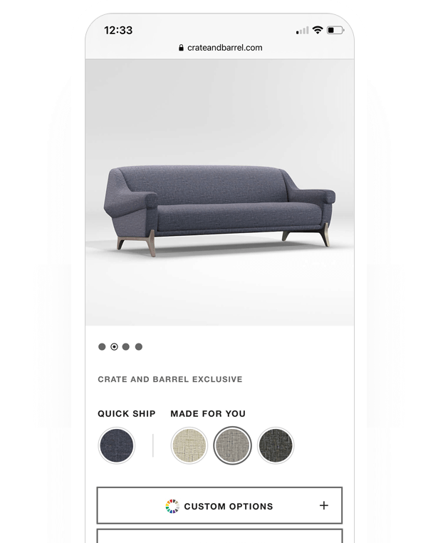
Custom products can be a huge draw. However, customizable products won't do any good if mobile users can't easily toggle between product options. It doesn't matter how many customization options you have if they can't see them because the product preview is too big for their tiny screens.
What Does All This Mean for You?
Mobile users are incredibly important to eCommerce retailers. They're a huge (and growing) consumer base. You can't afford to lose them. But they're also slippery and hard to convert. Anything less than a stellar mobile eCommerce customer experience just isn't enough.
Quality images and customized products are the first steps. However, if your product customizer isn't built for mobile, then it could hurt page speeds, usability, and functionality. That's why it's so vital that it's 100% mobile-friendly!

What Makes a Product Customizer Mobile-Friendly?
.gif?width=600&name=kitchenaid%20AR%20(1).gif)
Having an exceptional mobile-friendly product customizer depends on a variety of factors. It's important to put yourself in the users' shoes. Make everything as quick and easy as possible, limit obstacles, and really think about how mobile devices work. Here are some examples.
On Mobile, Size Matters
Mobile screens have limited and precious real estate. Everything should fit on the screen without horizontal scrolling. Also, remember that the small screen makes everything seem bigger, including your text fields. Keep the TL;DR factor in mind.
To make the best use of the screen size:
- Ensure all images fit on-screen.
- Avoid huge blocks of unbroken text.
- Divide content with headers, bullets, and images.
- Avoid excessive scrolling.
- Keep pages short, sweet, simple, and to the point.
- Hide information behind expandable dropdown menus.
Prioritize ‘-Ability’ Features: Usability, Readability, & Clickability

Usability features like easy navigation and intuitive product designer controls are key. The easier, the better.
Limit unnecessary barriers to purchase using real-time pricing updates, design templates, and bulk actions. Customers should be able to easily put their favorite clipart image on a dozen t-shirts using simple, intuitive file uploads.
Usability also means cross-device compatibility. It doesn't matter if your online store's product configurator is on Magento or WooCommerce, a Shopify store, or your own site. A good product customizer app integrates seamlessly and works well on a desktop, mobile, or tablet device, across PC or Mac, and also with Android and iOS.
Threekit's product customizer, for example, has a mobile-friendly, universally compatible Shopify app. Our great app is easily available with free installation and a dedicated customer support team. Our conditional logic options also provide your online store's visitors with mobile-friendly customization options that you control.
Click here to learn more about our product customizer!
Readability is also important. Users shouldn't have to zoom. So use background and font colors with good contrast and easily readable font sizes. Speaking of size: When designing button size on the backend, remember that fingers are larger and less precise than cursors. Anything clickable should be easily tapped.
Accomplish this by:
- Making buttons, checkboxes, dropdown menus, and links large and easily clickable
- Spacing elements enough to avoid accidental clicks
- Visually highlighting and conveniently placing featured elements
Fast Loading Pages
Quality images load slower, and mobile users are notoriously impatient. Image compression plugins are important, but they're not always enough. Mobile-friendly product configurators like Threekit's generate fast-loading, pre-rendered images.
To ensure great page speeds:
- Limit image size
- Properly compress and format (JPG, PNG, or GIF) responsive images
- Test pages with Google's PageSpeed Insights
Mobile Matters
Users enjoy product customization features because it lets them feel like they're creating their own product rather than choosing from generic product options. That doesn't mean it has to be complicated, though. Mobile users want a fast, simple, and enjoyable shopping experience. So the right product customizer must provide exactly that.
To discuss whether Threekit is right for you, get in touch with us, and we'll see if we're a good fit!